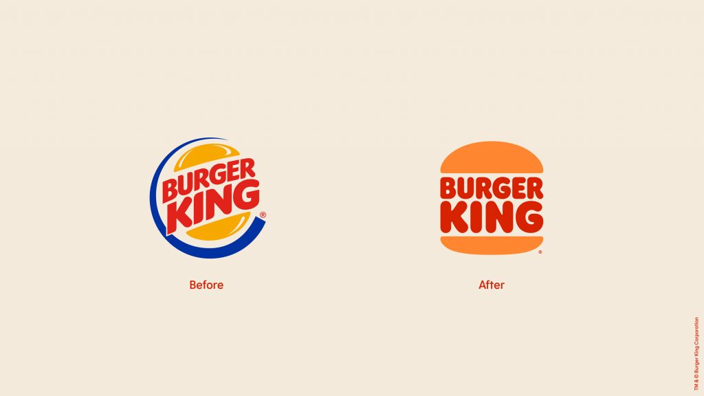
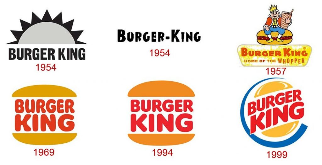
Burger King is starting 2021 off with a new look. The fast food chain ditched the blue curve and shiny burger buns that have been a part of its iconic logo since 1999 and released a fresh, retro-inspired design. In the official press announcement, Burger King described how the new colors are meant to dial up the sensorial aspect of the food and how the font now resembles the shapes of their foods – rounded, bold, and yummy.

If this logo looks familiar, that’s because it pays tribute to an old logo used from 1969 to 1999 yet uses a new, custom-made font called “Flame.”

The new logo is part of Burger King’s first total rebrand in over 20 years, complete with redesigned packaging, new employee uniforms, and safer, no-contact restaurant designs to keep pace with the times such as more drive-thrus, burger pickup lockers, and takeout counters. Burger King also recently launched a new $1 menu to attract more customers during the pandemic.
In my opinion, the new logo was long overdue and the rebrand is a smart marketing move for Burger King to increase sales and stand out amongst fast food rivals including McDonald’s and Wendy’s.

